Product
IA Refrastructure
UX redesign of Inphonite’s navigation system, improving information architecture, visual clarity, and usability within a Kendo Telerik–based design system.
Category
Client
Year

Project overview
Redesigned Inphonite’s navigation system to improve usability, logical grouping, and visual clarity—aligning a legacy information architecture with a new Kendo Telerik–based design system
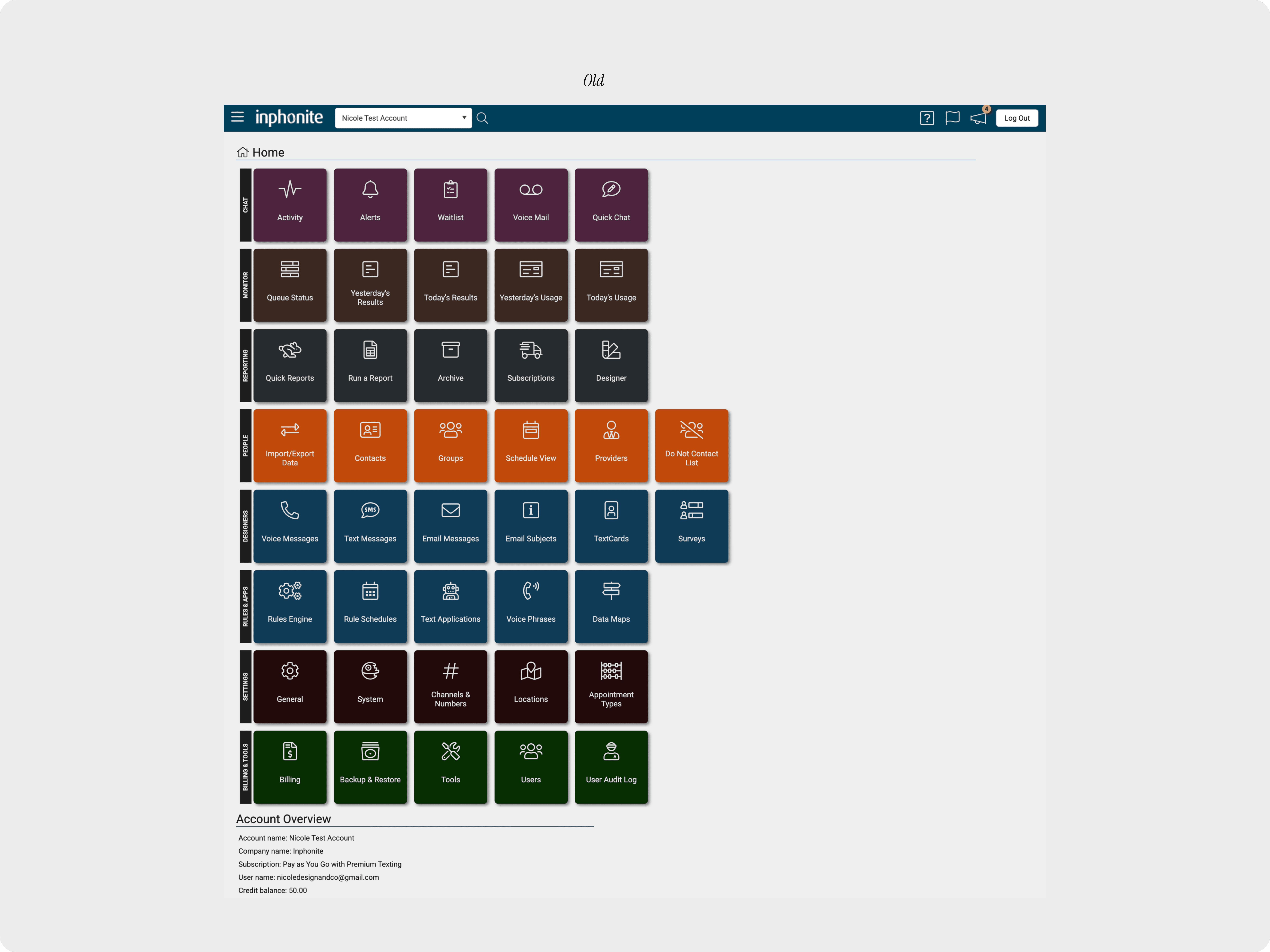
Problem
The existing navigation was cluttered and inconsistent, making it difficult for users to locate core tools. Related features were scattered across nested menus, labels were unclear, and visual states lacked hierarchy.
Approach
Simplify navigation through clear grouping
Reduce cognitive load when locating tools
Improve visual clarity and interaction states
Align navigation with the Kendo Telerik design system
Solution
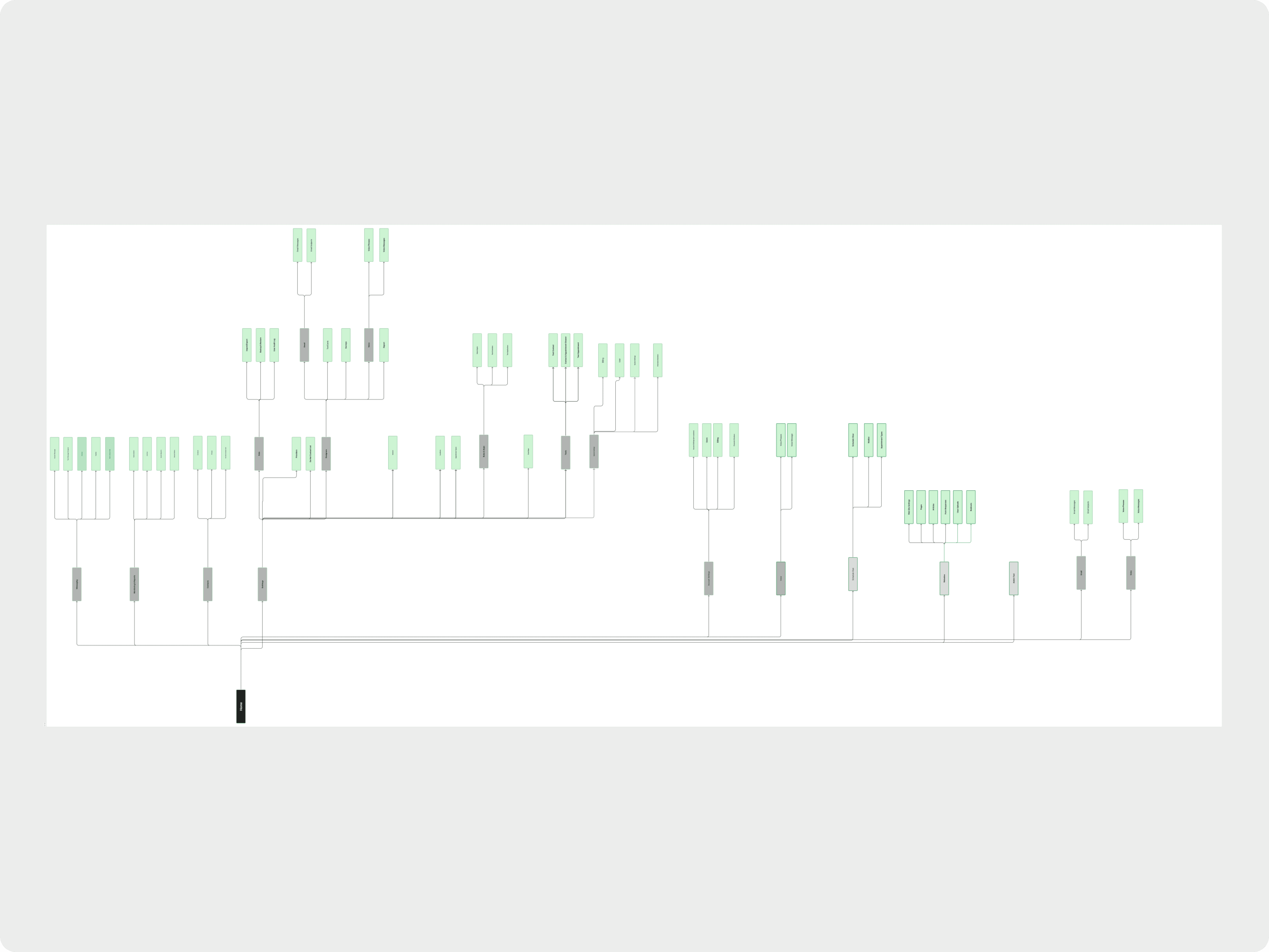
Re-Architected Navigation Structure
Led a collaborative card-sorting workshop to reorganize features into clear, goal-oriented sections:
Messaging
Voice
Surveys
Monitoring & Reports
Billing & Tools
UI & System Alignment
Refreshed typography and spacing
Introduced consistent hover and active states
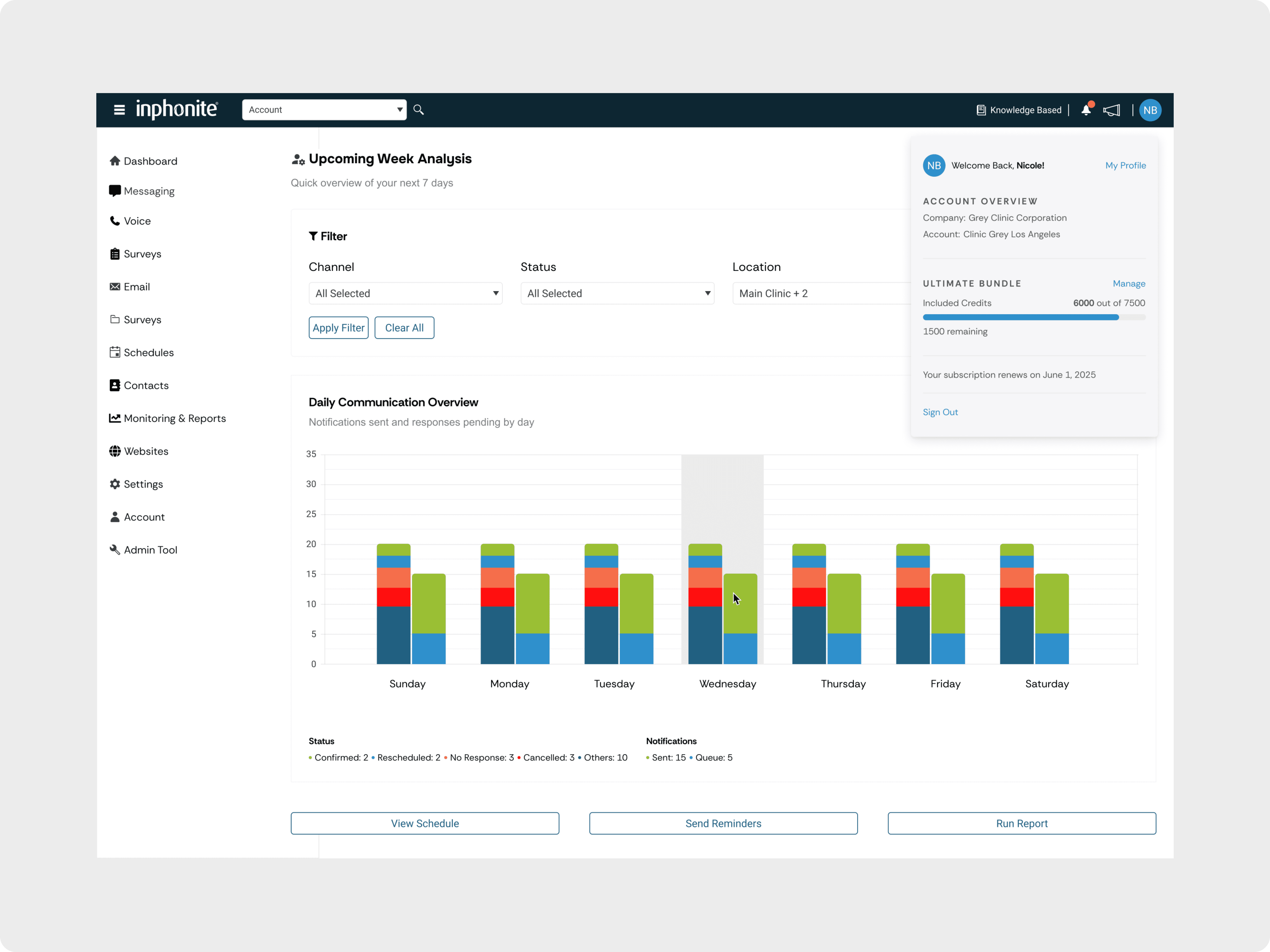
Implemented a cleaner, more scannable sidebar using Kendo Telerik components
Improved Utility & Visibility
Enhanced top navigation with quick access to account settings
Added credit usage visibility to reduce friction during daily workflows
Result
Faster access to core tools and reports
Reduced navigation friction and cognitive load
Consistent, scalable navigation aligned with the design system
Improved awareness of account and credit status