Product
Member's Dashboard
UX redesign of ATRF’s MyPension dashboard, improving task clarity, accessibility, and navigation within a legacy member self-serve portal.
Category
Client
Year

Project overview
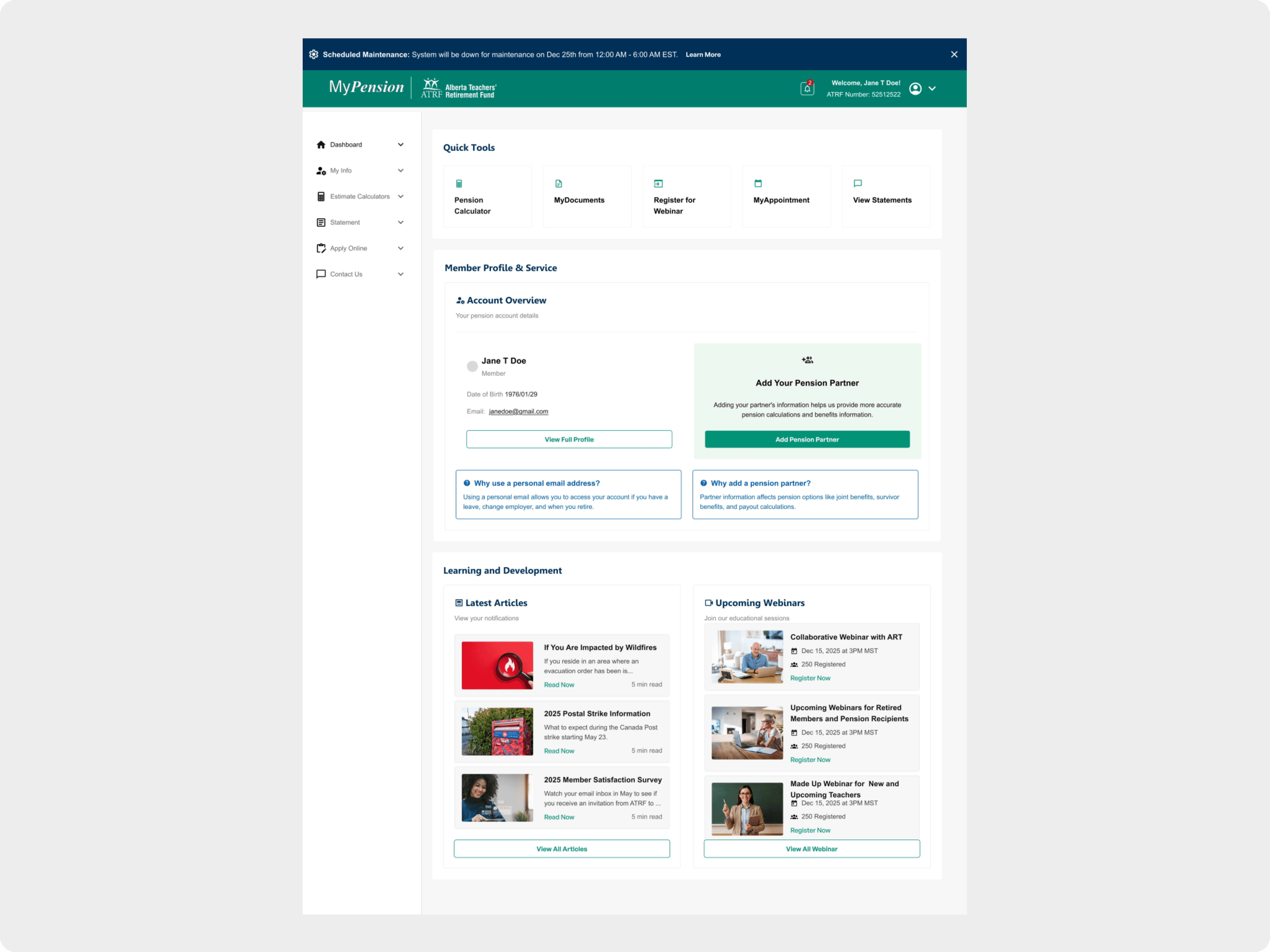
As a contract Product Designer for ATRF, I helped redesign the MyPension dashboard to simplify complex pension workflows within a legacy system. The new task-focused layout brings key actions—like pension estimates, beneficiary updates, and documents—front and center using accessible, scalable UI patterns.
Problem
The existing dashboard had become cluttered and fragmented, making it difficult for members to quickly access essential information. Navigation was inconsistent, accessibility standards were not met, and the layout did not scale well across devices.
Approach
Surface key member actions immediately
Improve readability and visual hierarchy
Meet WCAG 2.1 AA accessibility standards
Create a scalable foundation for future portal updates
Solution
Task-Focused Dashboard Layout
Reorganized the dashboard around modular cards highlighting top member actions, supported by contextual details like status and last-updated timestamps.
Improved Information Architecture
Removed redundant links
Simplified navigation paths
Prioritized the most common member tasks
Accessibility & Responsiveness
Improved contrast, type hierarchy, and focus states
Implemented a flexible grid system that adapts cleanly from desktop to mobile
Result
Reduced time-to-task for primary actions
Fewer navigation-related support requests expected
Established a repeatable, card-based layout for future sections
Learnings
Task hierarchy drives clarity more effectively than content volume
Designing for accessibility early prevents costly retrofits
Strong IA principles pay off even within tight scope and legacy constraints